


Working with product marketing in a digital age can sometimes be hard and things are changing fast. As a marketer you need to stay up to date with trends and analyze your data to see movements on your website and always be on top in order to improve your content. Websites are a never ending story.
Moving a button from top of the landing page to the button can be devastating for business, adding a pop up to the front page might just want visitors to drop off (I hate those pop ups when you can’t even close the tab without encouraging me to subscribe, wtf is that?) or having a big productional video in the background of the header which no one cares about and it’s making your website super slow. This list can go on and on.
How are websites working along with product marketing in 2020?
It’s easy to look in the mirror and look back in how websites were designed a year or five years ago. But how are product marketing and web design moving into the future and why? I have seen some trends this year in how big companies are redesigning their landing pages and mainly the front page. Now, it’s up to the visitors to judge how they like it.
The War of the decade: Main menu vs Footer
When I’m entering a landing page of any website I always expect to find all pages of the website from the main menu. This makes sense right? But the last couple of years it has been a shift in where to store website information and it all started with blog posts. We all know that content is king and since we are producing so much content we also need to prioritze what to show in the menu and not. The trend are therfore to scale down the main menu to contain only the crucial: Product information, pricing and show cases.
But where have all the other pieces gone? About us, career page, resources with white papers and one pages, login link, book a demo, help center and contact us?
We are of course moving all that shit down to the footer. It’s smart and it’s like cleaning at home: You are cleaning but you are also just throwing it all into one wardrobe and closing it. “Let’s get rid of all this shit. We can’t really throw it all away so let’s keep it in the footer”.
Since this trend are becoming more popular and more companies are having a clean main menu and shit load of stuff in the footer – I actually starting to like it and it making my browsing faster. If I want to know more about the company or what open positions they have – I always go to the footer instead of trying to navigate through the main menu. “All shit is down in the footer”.
GIF animations are here to stay
Since the beginning of time we have been using GIF animations in some way. Back then, we could referring them to Flash or big heavy movies as GIF’s implemented on the front page and shutting down all computers who came by. The last couple of years it has been very popular to use GIF animations in both product marketing for nuturing leads or story telling of new product changes. Companies are combining there visual designs with using GIF animations and without doing animations showing a screenshot of the product: it’s more common to use icons, colors and shapes that are not part of your product but part of your company brand.


Using GIF animations in the right way and it can be very powerful for your product marketing and your brand but as soon as you “over-do-it” it will become a mess and close to informal. If you want to use this as a part of your marketing strategy you will need to straight this out with the product team and marketing partners to make everyone understand why you should use it, where and when.
Comic sans headline – what is happening?
The third thing I want to highlight is that the last couple of months I have noticed big brands are changing the font style of the headline (H1) to something completely different from the body language.
At first sight I laughed and asked my fellow colleagues why the world are going crazy. The more companies I saw changing the font style of their landing pages the more convinced I got that they might be into something.

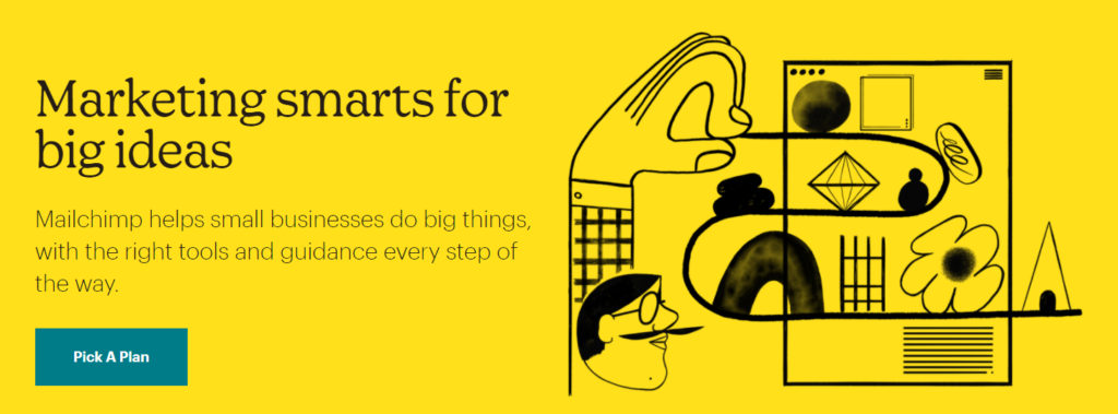

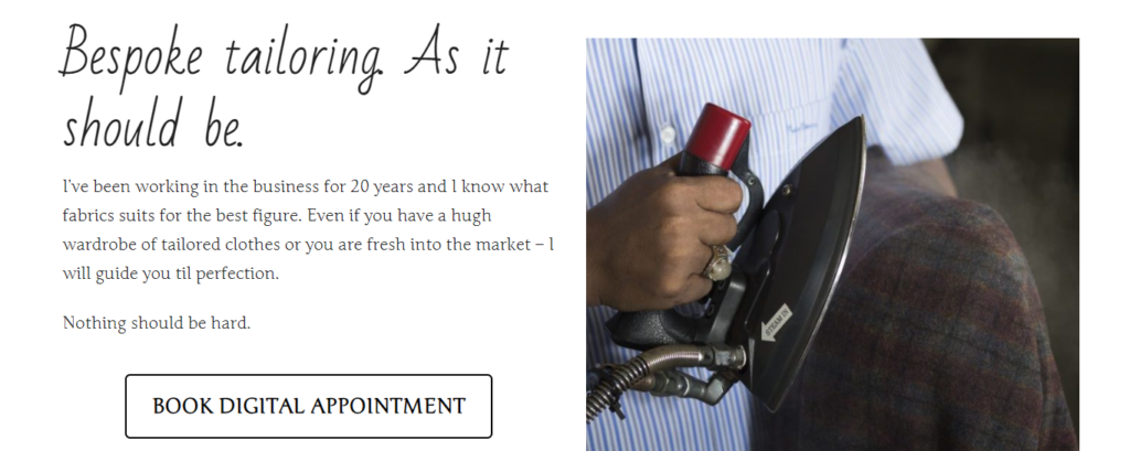
These two examples are using two different headline styles. They are both interesting but in different ways and if you manage to keep the font style simple and not taking over to much, or making the body hard to read I am all in for this.
I like all of these three trend changes, even if it took me a while to admiring it. But I figure web design and product marketing needs to change and stand in the front line for innovative ways of selling a product. As a marketer you need to be brave and not be like everyone else. Including these three topics in your marketing will not make you special – but it will make your website more attractive.